Fundamentals11 min read
Why "Beautiful Model" Is the Worst Prompt You Can Write
The gap between a plastic-looking AI portrait and a usable one is not the model you use. It is the four layers most prompts leave out — subject, garment, light, and camera.
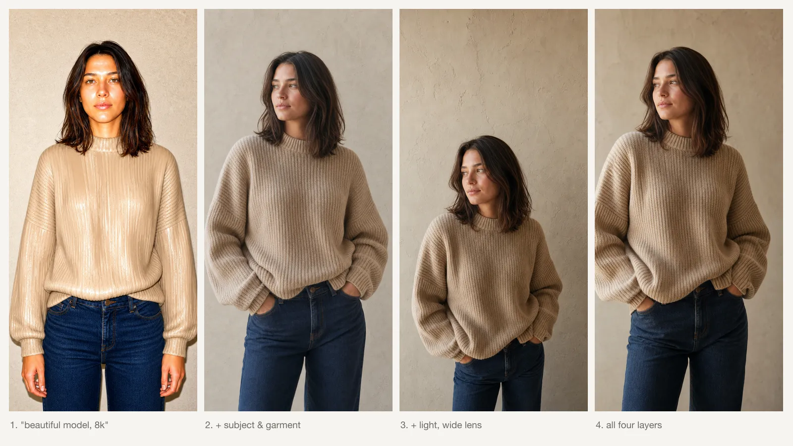
Everyone writing prompts for AI model photography starts at roughly the same place. You have a product — a sweater, a pair of earrings, a dress — and you want a photo of someone wearing it. So you type the obvious thing:
beautiful model wearing a beige knit sweater, high quality, photorealistic, 8k
And you get back something that is technically a photograph of a person in a sweater, and is also completely unusable. The skin has that waxy, over-smoothed quality. The lighting comes from everywhere and nowhere. The sweater looks like it was painted on rather than woven. Put it next to a real product photo and anyone can tell within half a second which is which.
The instinct at this point is to blame the tool. Maybe GPT Image is the wrong choice, maybe you need Midjourney, maybe there is a better model coming next month. Occasionally that is true. Far more often, the problem is that the prompt above contains almost no usable information, and the model is filling in every one of those gaps with an average.
What “beautiful model” actually asks for
It helps to think about what an image model does with a vague adjective.
These models learn from enormous collections of captioned images. Every phrase in your prompt maps to some region of what they learned — a distribution of images that were captioned that way. When you write something precise, like 85mm lens, f/2, shot from slightly below eye level, you are pointing at a narrow, coherent region. Nearly every image in that region shares real visual properties: compressed background, shallow focus falloff, a specific facial geometry.
When you write beautiful, you point at an enormous region instead. Retouched magazine covers. Instagram selfies. Stock photography. Video game renders. Wedding photos. Beauty-filter app output. They have almost nothing in common except that someone, somewhere, described them with that word.
So the model does the only sensible thing available to it: it returns something near the centre of that region. The average of every image ever captioned “beautiful.”
This reframes the whole problem. You are not trying to ask for a better image. You are trying to ask for a narrower one. Every word that meaningfully constrains the output moves you away from the mush at the centre.
It also explains why quality tags fail. Words like high quality, masterpiece, 8k, and award-winning feel like they should help, but they do not name any visual property. They appear next to good images and bad images alike. They are, at best, a rounding error, and they crowd out the specificity you actually needed.
The four layers
Over a lot of iterations, the prompts that reliably work turn out to describe the same four things. Not because there is anything magic about the number four, but because these are the four decisions a real photographer makes before pressing the shutter — and each one leaves visible evidence in the final frame.
| Layer | What it fixes | What happens if you skip it |
|---|---|---|
| Subject | Who is in frame, their age, build, expression, pose | An averaged face with a vacant expression |
| Garment | Material, cut, fit, colour, how it drapes | Fabric that reads as painted-on rather than worn |
| Light | Direction, quality, source, colour temperature | Flat ambient light with no shadow direction |
| Camera | Focal length, aperture, distance, angle | Wide-angle distortion and flat, uncompressed depth |
The order matters less than the coverage. What matters is that if you leave a layer out, the model does not leave it blank — it fills it with the average. A missing layer is not a neutral choice, it is a choice you delegated.
Layer 1 — Subject
The goal is not to describe a specific person. It is to give the model enough constraint that it stops averaging faces together.
a woman in her late twenties, shoulder-length dark brown hair loosely tucked
behind one ear, relaxed [neutral expression / faint smile], looking slightly
off-camera to the left, standing with weight on her back foot, one hand resting
in her pocket
Two things carry most of the weight here.
Expression and gaze. Looking slightly off-camera is one of the highest-leverage phrases in portrait prompting. A huge share of the training data is direct-to-camera stock and selfie imagery, so a direct gaze pulls you straight back toward that averaged look. Breaking eye contact moves you toward editorial photography, which is where most commercial imagery actually lives.
Pose specifics. Weight on her back foot and one hand in her pocket do far more than standing naturally. Natural is another averaging word. Weight distribution is a physical fact the model can render.
What to leave out: exhaustive facial descriptions. Piling on high cheekbones, full lips, almond eyes, defined jawline pushes you toward the beauty-filter region of the distribution — the exact place the plastic look comes from.
Layer 2 — Garment
If you are selling the garment, this is the layer that determines whether the image is commercially usable at all. A picture of a plausible sweater does not sell your sweater.
oversized beige ribbed knit sweater in chunky merino wool, dropped shoulders,
ribbed cuffs, hem falling just below the hip, fabric visibly heavy enough to
hold its shape, paired with straight-leg dark denim
Three moves matter.
Name the material, not just the look. Chunky merino wool renders differently from cotton jersey, which renders differently from cashmere blend. These are real physical differences the model learned, and material is the single strongest lever on how a garment reads.
Describe how it hangs. Dropped shoulders, falling just below the hip, heavy enough to hold its shape. Drape is what separates a photograph of clothing from a render of clothing.
Colour with a qualifier. Beige is a wide range. Warm oatmeal beige or cool greige narrows it considerably. If you are matching an actual product, this is where you spend your specificity budget.
Layer 3 — Light
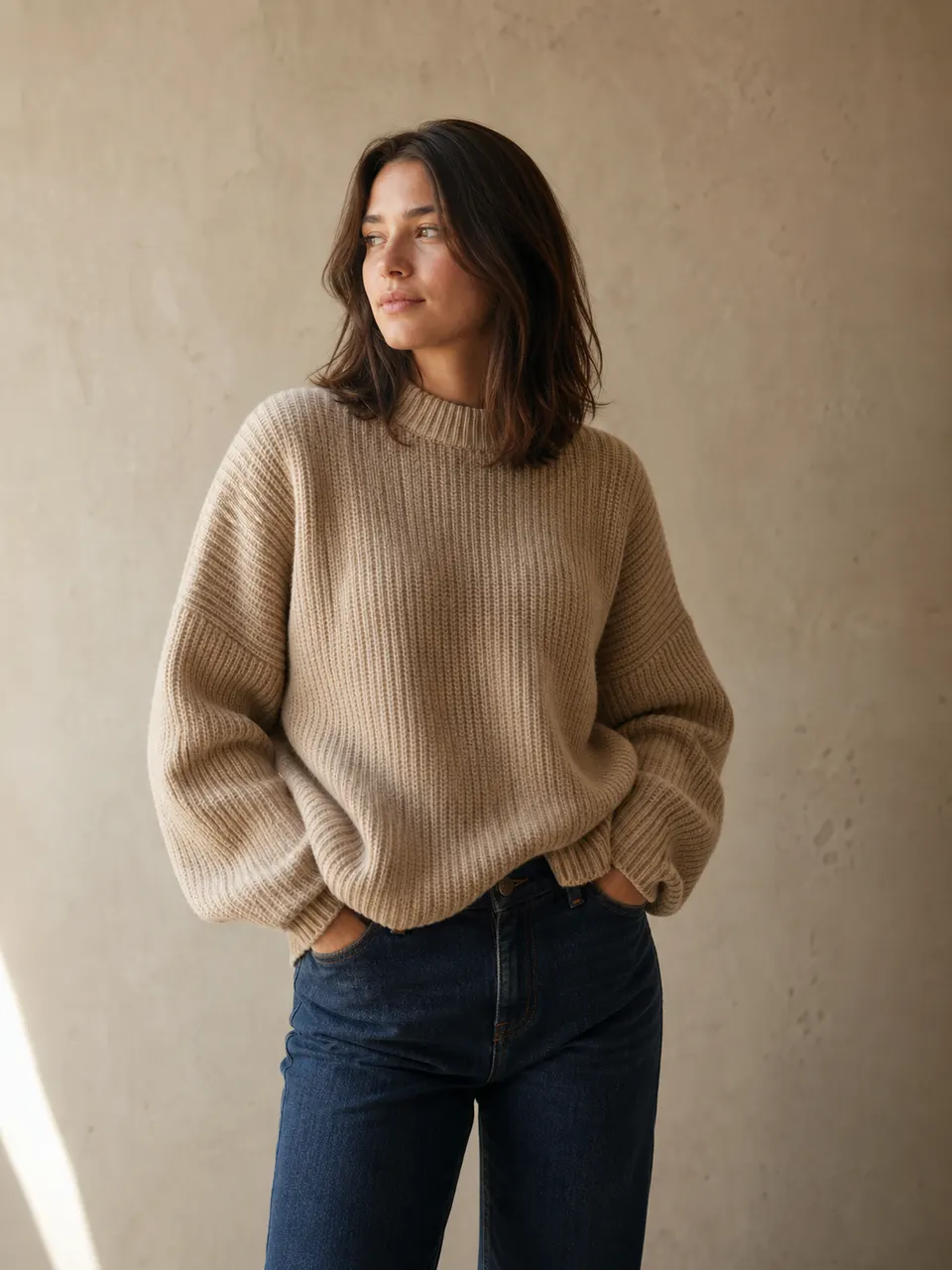
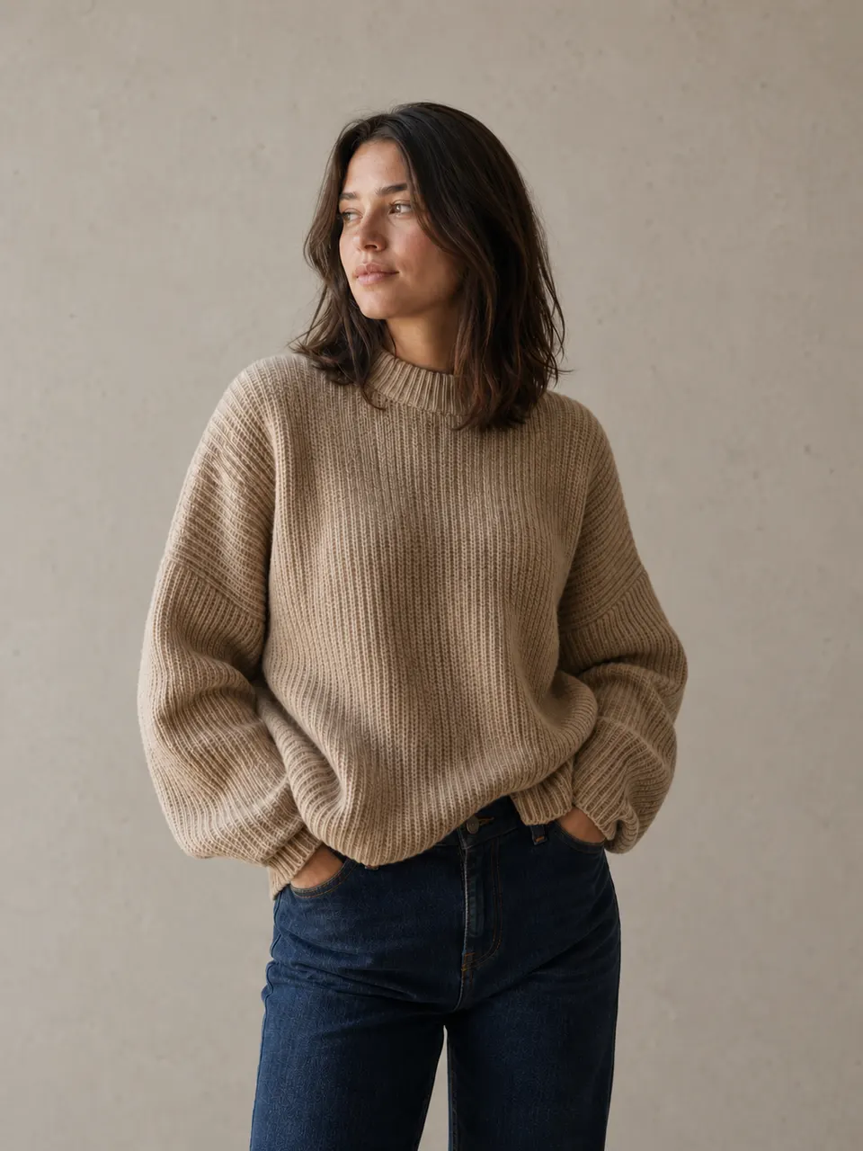
If you only add one layer to your current prompts, add this one. Lighting is the layer that most reliably converts an AI-looking image into a photograph-looking one, and it is the layer that almost everyone skips.
soft directional daylight from a large window at camera left, gentle falloff
across the background, subtle shadow under the jawline, warm late-afternoon
colour temperature, no harsh highlights on the skin
Every lighting description needs three components:
- Direction — from camera left, from behind and above, frontal but slightly off-axis. This is what creates shadow, and shadow is what creates the perception of three dimensions.
- Quality — soft, hard, diffused, specular. Soft light comes from a large source close to the subject; hard light from a small or distant one. This controls how abruptly shadows terminate.
- Source — large window, overcast sky, single softbox, golden hour sun. This bundles colour temperature and falloff behaviour into one phrase the model already understands well.
 BeforeAfter
Notice what the lighting layer did that no amount of high quality, photorealistic, 8k could: it gave the image a physical logic. There is now a light source in a specific place, and everything in the frame is consistent with it.
Layer 4 — Camera
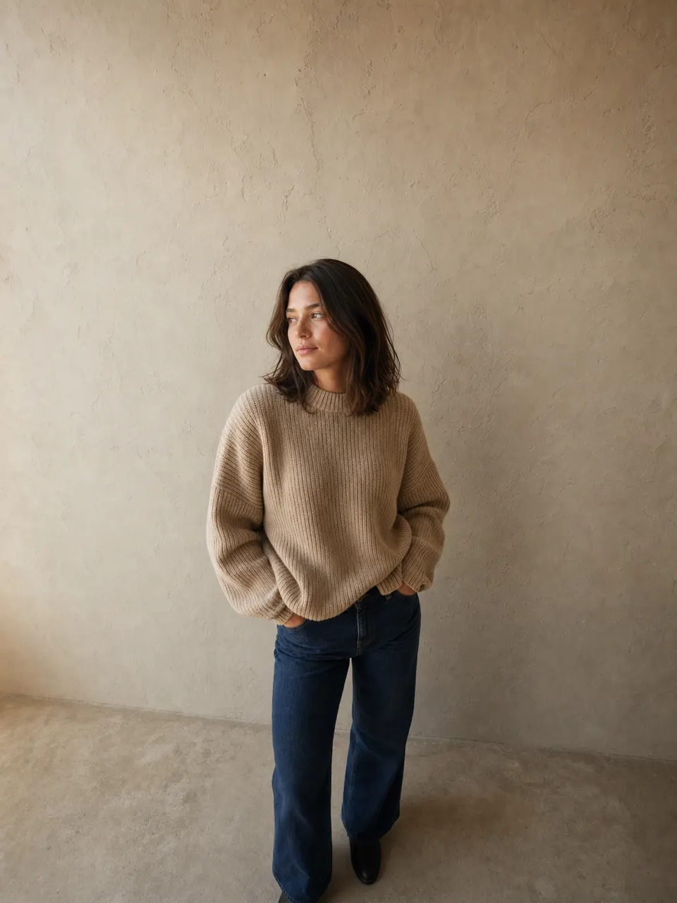
The camera layer is what makes an image read as photographed rather than generated. Real photographs are made with real optics, and real optics have characteristic distortions.
shot on 85mm lens at f/2, framed from mid-thigh up, camera at chest height,
shallow depth of field with the background falling softly out of focus,
natural perspective with no wide-angle distortion
The pieces:
- Focal length. 85mm is the workhorse for commercial portraiture — it compresses the background pleasantly and renders facial proportions without distortion. 35mm gives you an environmental, editorial feel. 24mm and wider will distort faces, which is occasionally a deliberate choice and usually not.
- Aperture. f/2 gives clear subject separation. f/8 keeps the garment sharp front to back, which matters more than you would think for product work — a beautifully blurred sleeve is a sleeve the customer cannot evaluate.
- Camera height. At chest height or slightly below eye level. This one line prevents the accidental looking-down-at-the-subject angle that plagues default outputs.
- Framing. Mid-thigh up, full length, head and shoulders. Be explicit, or the model picks for you.
 BeforeAfter
Putting it together
Here is the same request as the opening prompt, with all four layers present.
A woman in her late twenties with shoulder-length dark brown hair, relaxed
neutral expression, looking slightly off-camera to the left, standing with
weight on her back foot. She wears an oversized warm-beige ribbed knit sweater
in chunky merino wool with dropped shoulders, paired with straight-leg dark
denim. Soft directional daylight from a large window at camera left, gentle
falloff across a plain plaster wall, warm late-afternoon colour temperature.
Shot on 85mm at f/2, framed from mid-thigh up, camera at chest height, shallow
depth of field.
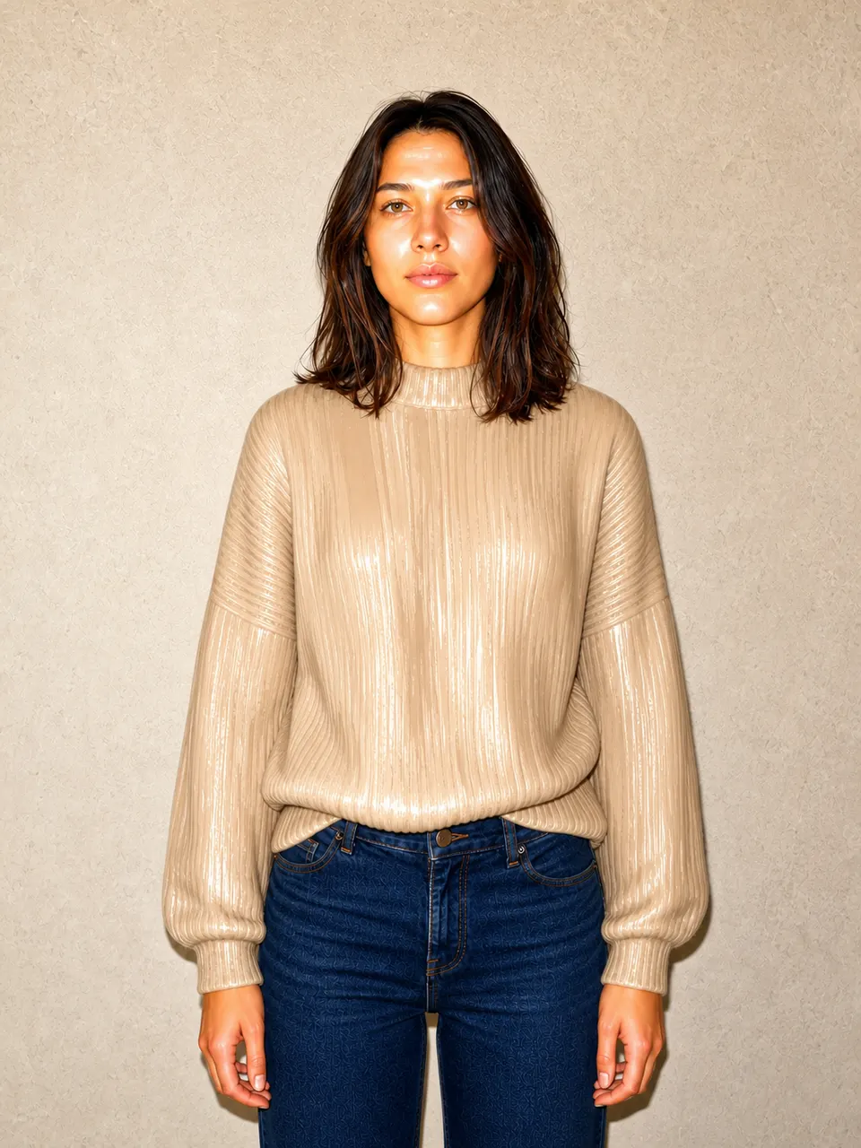 BeforeAfter
The difference is not subtle, and none of it came from a better tool or a longer list of quality tags. It came from replacing four averaged decisions with four stated ones.
A template you can reuse
Strip the specifics out and you get a fill-in-the-blank structure that works across most fashion and beauty portrait work.
[AGE + BUILD] with [HAIR], [EXPRESSION], [GAZE DIRECTION], [POSE + WEIGHT
DISTRIBUTION]. She wears [GARMENT: fit + colour + material + construction
detail], paired with [SECONDARY ITEMS]. [LIGHT QUALITY] light from [DIRECTION],
[SOURCE], [BACKGROUND BEHAVIOUR], [COLOUR TEMPERATURE]. Shot on [FOCAL LENGTH]
at [APERTURE], [FRAMING], camera at [HEIGHT], [DEPTH OF FIELD].
Two habits that pay off quickly:
Keep the layer that works. Once a lighting description gives you a look you like, reuse that exact text across the whole shoot. Consistency across images comes from reused text, not from luck.
Set aperture by intent, not by aesthetics. Shallow depth of field looks good and hides garment detail. For a product listing, that is a bad trade. For a lifestyle or social image, it is the right one.
Where to go from here
The four-layer framework is the base. Each real use case adds its own constraints on top:
- Product listing photography has requirements the framework alone does not cover — background consistency, garment sharpness, and platform-specific framing rules. That is covered in creating AI model photos for product listings.
- Keeping the same model across a whole catalogue is the hardest problem in this space and needs a technique of its own. See consistent AI models across multiple photos.
- Tool choice does eventually matter, once your prompts are good enough for the difference to show. ChatGPT vs Midjourney for fashion portraits compares them on the work this article describes.
If you take one thing from this: your prompt is not a wish, it is a specification. Every layer you leave unspecified is a layer the model fills with an average — and averages are exactly what makes an image look artificial.
Related guides
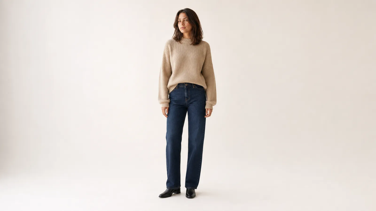
Ecommerce
AI Model Photos That Actually Work on a Product Listing
A listing image has a job to do, and it is not looking good. What changes when you prompt for ecommerce — aperture, background, framing, and the returns problem nobody mentions.
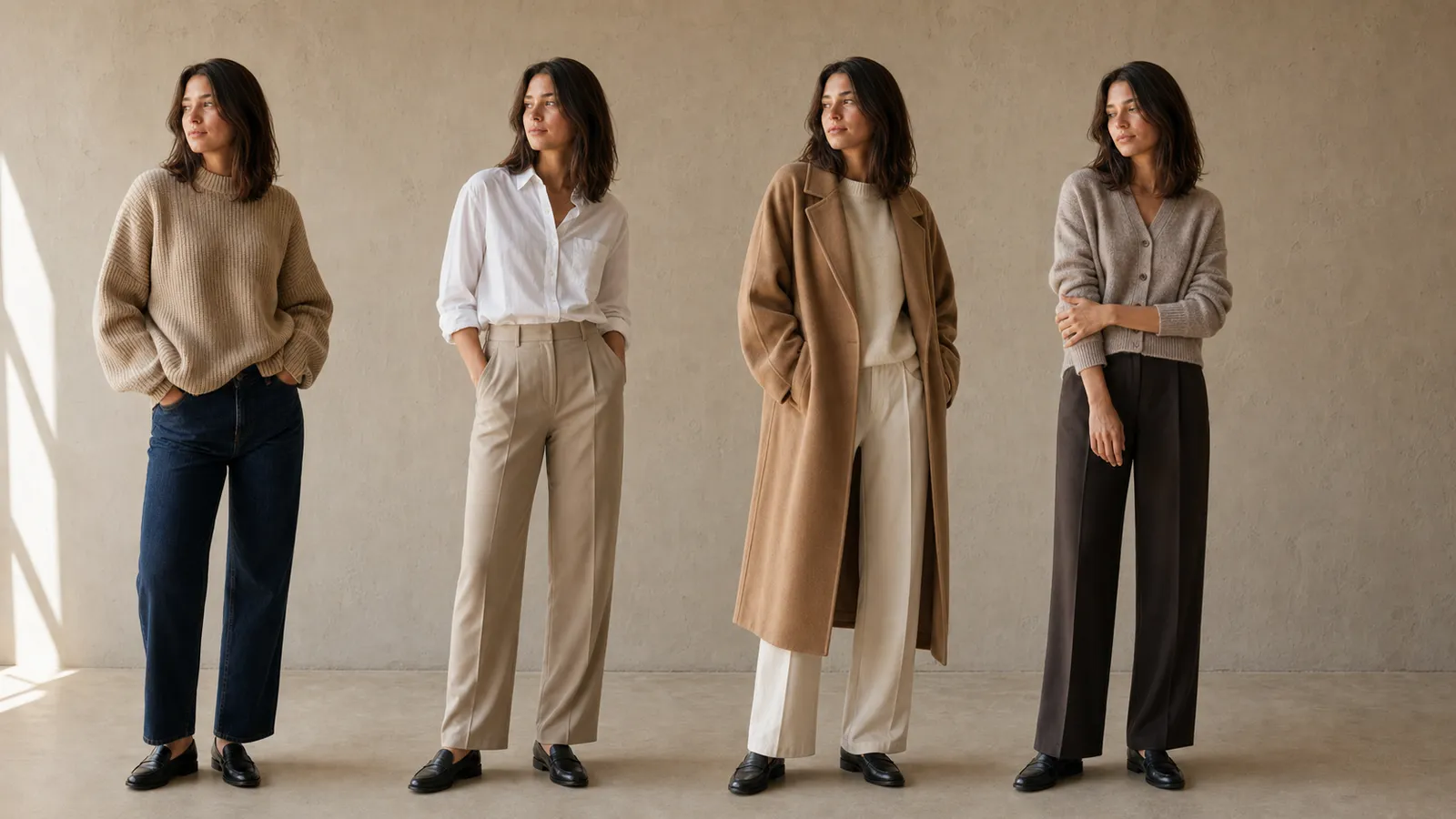
Ecommerce
How to Keep the Same AI Model Across an Entire Catalogue
The same prompt gives you a different face every time. Here is why identity drifts between generations, and the seed-plus-reference workflow that actually holds a model steady across twenty images.
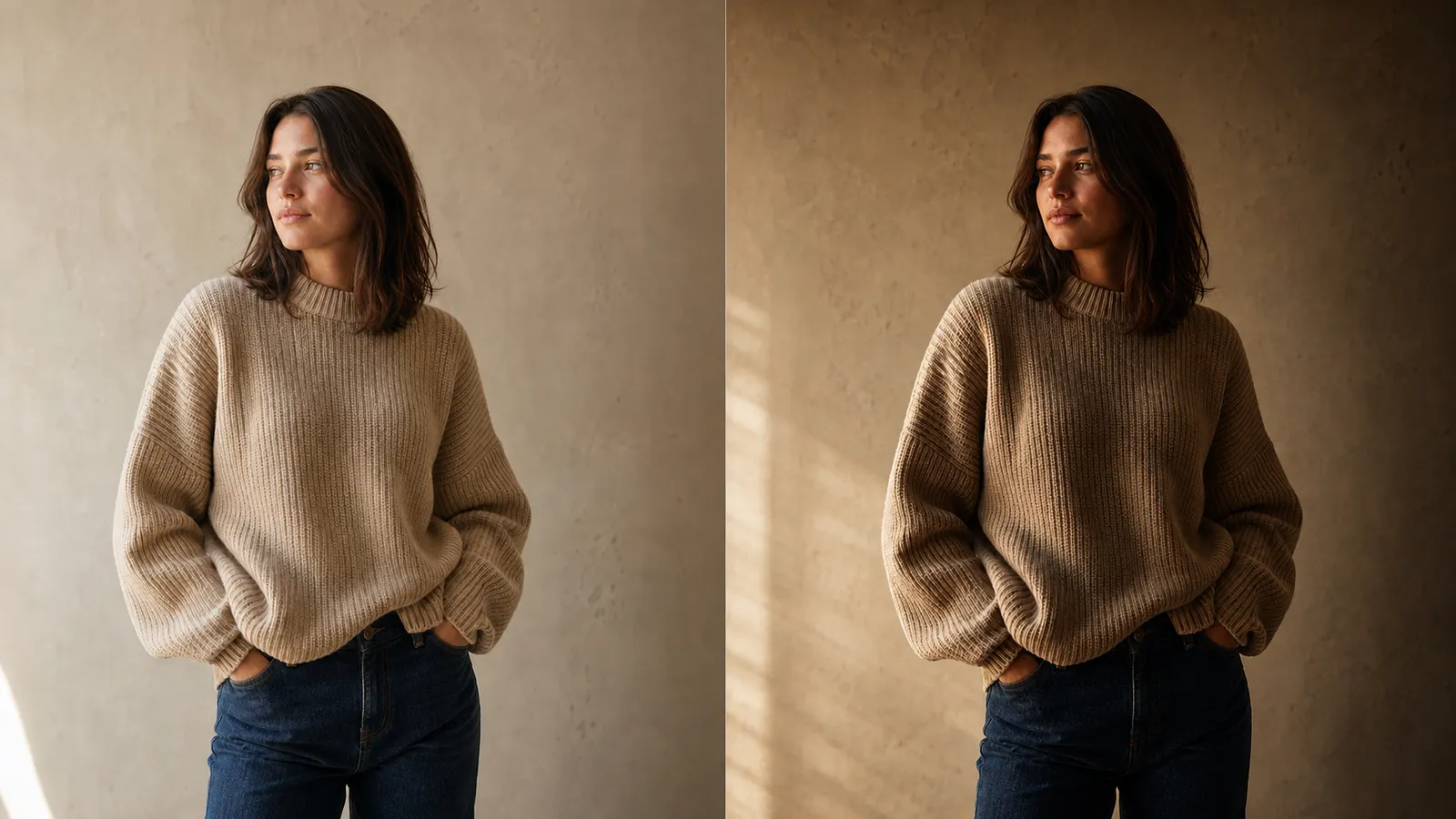
Tool comparisons
ChatGPT vs Midjourney for Fashion Portraits
Not "which is better" but which one fits the job. How the two tools differ on prompt handling, identity consistency, colour accuracy, and iteration speed — and when the answer is to use both.