Ecommerce6 min read
AI Model Photos That Actually Work on a Product Listing
A listing image has a job to do, and it is not looking good. What changes when you prompt for ecommerce — aperture, background, framing, and the returns problem nobody mentions.
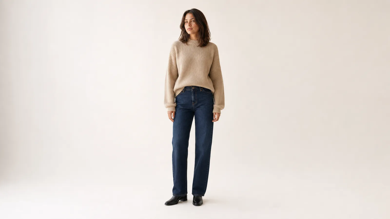
Most advice about AI fashion photography is written for images that need to look good. A product listing image has a different job: it needs to let someone decide whether to buy something they cannot touch.
Those two goals conflict more often than you would expect. The moody backlit shot with the beautifully blurred background is a better photograph and a worse listing image, because the customer cannot see the weave, the seam, or how the hem actually falls.
This guide assumes you already have the four-layer framework. Here is what changes when the image has to sell something.
The listing image’s actual job
Three things, in order:
- Show the garment accurately. Colour, texture, cut, and drape have to match what arrives in the box.
- Show fit on a body. This is why a model beats a flat lay — the customer needs to see where it sits.
- Survive a thumbnail. Most listing images are first seen at around 200px wide in a search grid.
Everything below follows from those three.
What changes from the general framework
| Layer | General portrait | Product listing |
|---|---|---|
| Camera | 85mm at f/2, shallow | 85mm at f/8, garment sharp throughout |
| Light | Directional, dramatic falloff | Soft, even, colour-accurate |
| Background | Whatever suits the mood | Plain, consistent across the whole catalogue |
| Framing | Whatever composes well | Full garment visible, room to crop square |
| Pose | Editorial, expressive | Neutral, garment not obscured |
The pattern: every choice that adds mood subtracts information. Listings are an information medium.
Aperture is the big one
f/2 blurs the background beautifully and also softens the far sleeve, the lower hem, and any part of the garment not exactly in the focal plane. A customer trying to judge knit weight from a blurred sleeve cannot do it — so they either do not buy, or they buy and return.
shot on 85mm lens at f/8, entire garment sharp from front to back, fabric
texture clearly legible, framed full-length with headroom above and space
below the feet, camera at chest height, no wide-angle distortion
Light has to be accurate, not interesting
Warm late-afternoon light is lovely and it also shifts every colour in the frame. If your sweater is cool grey and the image renders it warm beige, you have created a returns problem.
soft even studio lighting from two large diffused sources at 45 degrees either
side, neutral 5500K colour temperature, gentle shadow definition to show
garment structure, no colour cast, no harsh specular highlights, subtle
grounding shadow beneath the feet
That last clause matters more than it looks. Without a contact shadow, a model on a white backdrop appears to float, which reads as fake immediately.
Background: pick one and never change it
A consistent backdrop across your catalogue does two things. It makes your collection page look like a brand rather than a bin, and it removes a variable when you are debugging why one image looks off.
plain seamless off-white studio backdrop, evenly lit with no visible corner
or horizon line, no props, no furniture, no texture, background slightly
brighter than the garment
That last detail — background brighter than the garment — is what keeps the product from disappearing into the backdrop at thumbnail size.
Framing for the crop you do not control
Marketplaces crop. Amazon wants square, Instagram Shopping wants 4:5, your own site probably wants something else. If you frame tightly, someone else’s crop will cut the hem off.
Generate with deliberate margin: full-length, headroom above, floor space below, and empty space on both sides. You can always crop in. You cannot crop out.
The full listing prompt
Everything combined, with the identity anchor from the consistency workflow:
Using the attached image as the reference for the model’s identity, generate a product photograph of the same woman — same face, same hair, same build.
She wears [GARMENT: fit + exact colour + material + construction detail], paired with [SECONDARY ITEM]. Relaxed neutral standing pose, arms clear of the body so the garment silhouette is unobstructed, weight even, looking at the camera with a neutral expression.
Soft even studio lighting from two large diffused sources at 45 degrees either side, neutral 5500K colour temperature, gentle shadow definition, no colour cast, subtle grounding shadow beneath the feet.
Plain seamless off-white studio backdrop, evenly lit, no props, background slightly brighter than the garment.
Shot on 85mm at f/8, entire garment sharp front to back, fabric texture clearly legible, framed full-length with headroom above and space below the feet, camera at chest height.
A three-image set per product
One image does not answer the questions a buyer has. The reliable pattern:
1. The listing hero. The prompt above, exactly. This is the thumbnail and it does the selling.
2. A detail shot. Same garment, cropped to the texture that matters — the ribbing, the collar, the button placket.
Close-up detail photograph of the same garment on the same model, framed from
shoulder to mid-torso, focused on the knit texture and shoulder seam
construction. Same studio lighting and background as the reference. Shot on
100mm macro at f/8, fabric weave clearly resolved, colour accurate.
3. A context shot. One image where the mood rules are allowed to apply — natural light, real environment, f/2.8, editorial framing. This is where the garment gets to look desirable rather than merely legible. It goes last in the gallery, never first.
Before you publish
- View every image at 200px. If the garment is not identifiable at thumbnail size, the image fails at the only size that determines whether anyone clicks.
- Compare rendered colour to the physical product under neutral light. Not on a phone screen in a warm room.
- Check your marketplace’s rules on AI imagery. Requirements differ and are changing; some platforms require disclosure, some restrict AI imagery in the primary slot.
- Look at the full set in a grid before committing, exactly as in the consistency guide.
The framing to keep: a listing image is a specification document that happens to be a photograph. Every choice that makes it more atmospheric makes it worse at that job. Save the atmosphere for image three.
Related guides
Fundamentals
Why "Beautiful Model" Is the Worst Prompt You Can Write
The gap between a plastic-looking AI portrait and a usable one is not the model you use. It is the four layers most prompts leave out — subject, garment, light, and camera.
Ecommerce
How to Keep the Same AI Model Across an Entire Catalogue
The same prompt gives you a different face every time. Here is why identity drifts between generations, and the seed-plus-reference workflow that actually holds a model steady across twenty images.